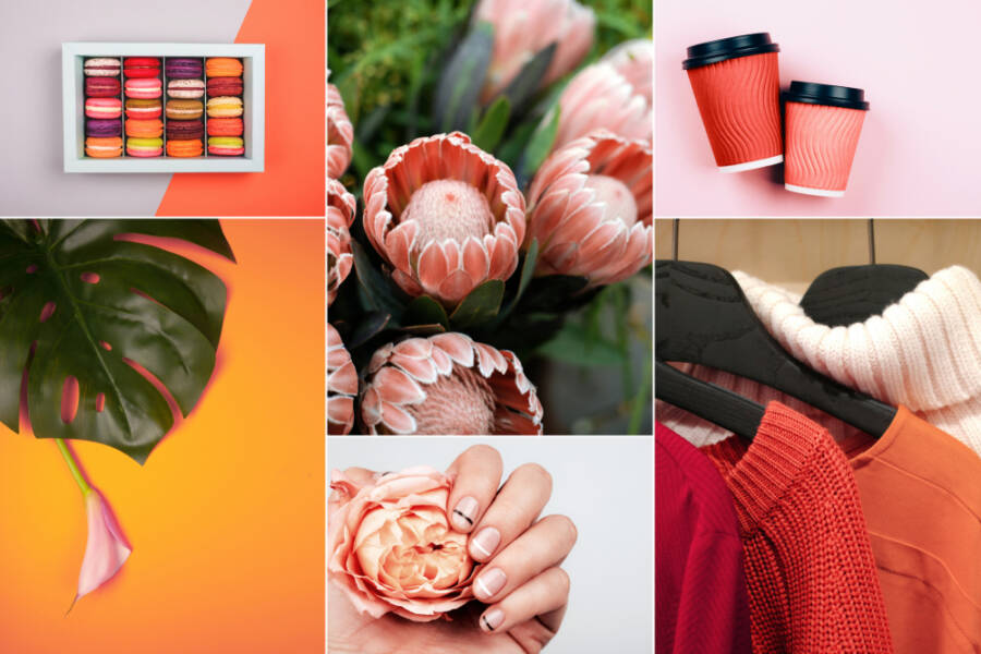
Building a cohesive Instagram feed that attracts followers and drives audiences is challenging. With an endless amount of influencers vying for attention, it’s hard to stand out from the crowd and entice followers to buy what you’re selling, whether that’s knowledge or vintage goods. But one of the best ways to do so is to create an on-brand and on-point Instagram aesthetic.

How exactly does an Instagrammer do this? We’re going to show you six tips for creating an Instagram aesthetic that’s on-brand. So grab your iPhone and sustainable blue light glasses and settle in for a guided lesson. It’s time to go to Instagram art school.
#1 Create Your Own Flat Lays and Styled Imagery
If you’re going to create an Insta aesthetic with stunning on-brand images, you’re going to need a high-quality phone with an exceptional camera. Many Instagrammers and influencers work with iPhones due to their amazing built-in camera features. As of late, the iPhone 13 has upped Apple’s game even more, with professional-grade autofocus for self-portraits and more. Of course, be sure to protect your phone from accidental drops with a phone case. The same goes for your AirPods and an AirPods case cover.
While there are many free stock photos available to improve your Insta feed, you want to offer unique imagery, too. This is where a phone comes in handy. You need a phone camera that goes above and beyond and captures selfies, but also offers flat lays and styled products that represent who you are and what you stand for. As you’re doing so, be sure that you’re following the rest of the tips below to create a cohesive look.
#2 Nail Down Your Grids
One of the first steps you need to take in creating an Instagram aesthetic is to nail down the grid layout you want to do it with. Play around with various layouts, whether it’s simple squares, a diagonal feed, tiles with intermixed quotes or rows to create a wider landscape image.
Wondering how you can “play around” without posting images? That part’s easy. You can find all sorts of apps that allow you to arrange your feed exactly how you like (and even auto-post directly to instagram), saving you time for other content-related tasks.
#3 Stick to a Style and Theme
Before you go shooting flat lays and after you’ve nailed down your preferred grid, decide on a style and theme and stick with it. Theme touches on your personality and is expressed in filters and fonts, but what we’re talking about here is the theme of your brand. For example, if you’re an author or writer, you might want to have a bookish theme with images of your favorite novels and Potterhead lingo that shows followers your proud nerdy side. If you’re an interior designer, you will want to showcase homes and offer decorating tips.

#4 Find Your Favorite Filters and Fonts
One of the best ways you can create a cohesive Instagram look is to find a favorite filter. Play around with the filters on your phone or use an app to find a favorite filter that enhances your images. Want some pro advice? While it’s tempting to switch up your filters, narrow down your favorites to a single filter and avoid a mismatched look.
The same goes with fonts. If you plan to do a tile grid consisting of images and wordplay like quotes, tips and information, make sure that it all flows. Follow the basic graphic design rule of using no more than three or four font styles.
#5 Pick a Personality (But Be Yourself, Too!)
Find an Instagram aesthetic that suits your personality. How do you want to present yourself and what you stand for? For this, you might want to do a little soul-searching. Consider things like your humor or your overall character. Are you flirty and bubbly or serious and straight-to-the-point? Do you have an adventurous spirit or do you consider yourself a part of the local community? However you perceive yourself, make sure followers perceive you that way, too.
That being said, it doesn’t hurt to take a peek at your Instagram analytics to know who your viewers and followers are. You can skew your brand one way or another to attract different audiences and gain more loyal followers that get you and your mission.
#6 Create a Mood Board for Reference
Mood boards are perfect tools to help guide you toward an on-brand Instagram aesthetic. By using an online app like Canva or Mural, you can play around with images that inspire you. If you’re unsure what kind of direction you want to take with your Insta aesthetic, this is a great first step. Your images and photos don’t even have to be your own, so long as they create a feeling and overall look — with color, subject matter and style inspo.

Once your mood board is complete, use it as a reference when you feel stuck or in a rut with your Instagram posts and imagery. Of course, if you feel like changing up the direction of your Instagram feed, use the mood board to see how you can slowly integrate it over.
Grow Your Followers with an On-Brand Insta Aesthetic
WIth these six tips, you can create the Instagram aesthetic of your dreams. Stick with your favorite filter and nail down those grids to make your feed pleasing to the eye. But more importantly, be authentic. While you want to reach and gain as many followers as possible, you want those followers to be loyal. Plus, it simply means you can be true to yourself.
TechnologyHQ is a platform about business insights, tech, 4IR, digital transformation, AI, Blockchain, Cybersecurity, and social media for businesses.
We manage social media groups with more than 200,000 members with almost 100% engagement.


