The latest studies show that 7 out of 10 shoppers are most likely to abandon their online carts. Abandoned carts cause companies and brands to lose around $18 billion in sales every year. However, all is not lost, as you can recover some of the lost sales by running cart abandonment email campaigns. Some expert email marketers suggest that you can recover up to 10% of the lost sales through recovery emails. Therefore, there is no reason for you to not start one for your brand. You can even use custom Mailchimp email templates to create your first campaign. Here are some examples of effective cart abandonment emails to inspire you.
Examples of cart abandonment emails
● Food52
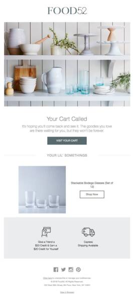
The recovery email from Food52 might look simple, but it follows all the best practices of creating a cart abandonment email template. Instead of using an imposing subject line, they have gone with a complimentary subject line as it is better suited to their brand’s voice. For the template, Food52 has used a hero image to display its product range. The email copy is short and subtly creates a sense of emergency by mentioning that the saved items in the cart will be removed soon.
They have also listed the products in the cart to remind the customers of what is in the cart. They have neither mentioned the price of the product, nor the total value of the cart. While it is usually recommended to mention these details, it is possible that mentioning these details generated negative results during their A/B tests. Finally, the CTA buttons lead the customer directly to the cart to complete their purchase.


Right from the subject line, Rudy’s Barbershop is offering free shipping to its customers. The subject line also implies that the offer will expire and should be used as soon as possible. As you open the email, the same things are stated more clearly and are highlighted in a different color compared to the rest of the email. The email copy starts with a witty one-liner and immediately moves on to business.
The email copy also states that the saved cart is going to expire along with the free shipping offer to strengthen the sense of urgency. In addition, the copy contains a hyperlink to the customer’s cart and the discount code for free shipping. They have then inserted the product images with details like the total price and the quantity. The terms and conditions state that the coupon code will only be effective for 24 hours.
● Jack Wills
Jack Wills leaves no stone unturned while running its recovery cart email campaign. They use a subject line that is a play on the words. Inside the email, they have created a reassuring copy that sends a reminder to the customer about their abandoned cart. They also added a touch of personalization by referring to their customer by their first name. Just like the examples mentioned above, Jack Wills also includes the items and other associated details in the email. Rather, they take it up a notch and share multiple angles of the product, along with its color, size, and price. The items also have their individual hyperlinked buttons. Furthermore, the template shows the total value of the cart.
However, unlike most of the recovery emails, they have chosen not to create a sense of urgency and push the customers to complete the transaction. This gives the impression that the brand cares more about the decision of the customer rather than their own sales. While it may reduce the effectiveness of the abandoned cart emails, but, in the long run, it will enhance the relationship the customer has with the brand.
● Moschino
Moschino has one of the most visually stunning cart abandonment email templates. The email template boldly displays the brand’s name. Moschino also subtly reminds the customer that they offer standard free shipping. The monochrome hero image slowly fades to white and displays the colorful products that were left behind by the customer. They also list the details of the product like color, price, and quantity. Moschino also included two CTA buttons that redirect the customer to the checkout page.
Since the items are quite expensive, they are assuring the customers that they have a highly secure payment gateway and the items can be easily returned within 14 days of the delivery date. While the email copy is in line with the aesthetics and the voice of the brand, it is not quite convincing compared to some of the others on the list. However, what they lack in the email copy, they make up for it in their stellar email design. You can also create a similar design for your brand using custom Mailchimp email templates.
Conclusion
Even though the designs are different, all the cart abandonment emails mentioned above share a similar structure and philosophy. They are listing their items to remind the customers why they liked the product in the first place. Brands are also offering free shipping to reduce the total value of the cart and encourage the customer to complete the purchase. And, lastly, they are creating a sense of urgency. As long as you are following these best practices, you can create an effective cart abandonment email campaign for your brand.
Author: Kevin George is the head of marketing at Email Uplers, that specializes in crafting Professional Email Templates, PSD to Email conversion, and Mailchimp Templates. Kevin loves gadgets, bikes & jazz, and he breathes email marketing. He enjoys sharing his insights and thoughts on email marketing best practices on email marketing blog.
TechnologyHQ is a platform about business insights, tech, 4IR, digital transformation, AI, Blockchain, Cybersecurity, and social media for businesses.
We manage social media groups with more than 200,000 members with almost 100% engagement.